Last update: 20240819
Synthetic data
Table of contents
This script will show you how to make synthetic (fake example) data. The data should match what you expect to see in a real dataset. The provided script demonstrates a practical approach for creating and utilising synthetic datasets in R, aimed at continuing data analysis development when access to original data is restricted due to legal or privacy concerns. This method allows developers and analysts to develop and test analytical models and data processing pipelines without compromising data governance policies.
Key Components of the Script:
- Libraries Used:
dplyrfor data manipulation.ggplot2for data visualisation.synthpopfor synthesising datasets, ensuring the synthetic versions maintain similar statistical distributions as the originals.patchworkfor combining plots into a single image for easier analysis.
- Datasets:
- The script utilises well-known R datasets,
mtcarsandiris, which exemplify numeric and categorical data types, respectively.
- The script utilises well-known R datasets,
- Synthesising Data:
- The
syn()function generates synthetic datasets, with subsequent verification steps to ensure these datasets match the original data in terms of structure and type.
- The
- Adding Sample Names:
- Using
sprintf()to generate formatted sample names provides unique identifiers that aid in managing and referencing samples during analyses.
- Using
- Data Visualisation and Comparison:
- Various plotting functions are crafted to compare the distributions between original and synthetic datasets through density plots, bar plots, and linear regression analyses, adapting the visualisation method based on the data’s characteristics (numeric vs. categorical).
- Saving Visual Outputs:
- The
ggsave()function is utilised to save generated plots to files, enabling easy distribution and review.
- The
Purpose and Benefits:
- Development Continuity: This approach supports the continuous development of data analysis tools in scenarios where actual data cannot be used.
- Model Testing: It facilitates preliminary testing of statistical models, ensuring they will perform as expected with real-world data.
- Privacy Compliance: By using synthetic data, the method adheres to data privacy laws, ensuring that personal or sensitive information is not disclosed.
This technique is especially valuable in sectors such as healthcare or finance, where data sensitivity is critical. It provides a viable solution to data access limitations while ensuring compliance and development efficiency.
Code example
1. Example with numeric dataset (mtcars)
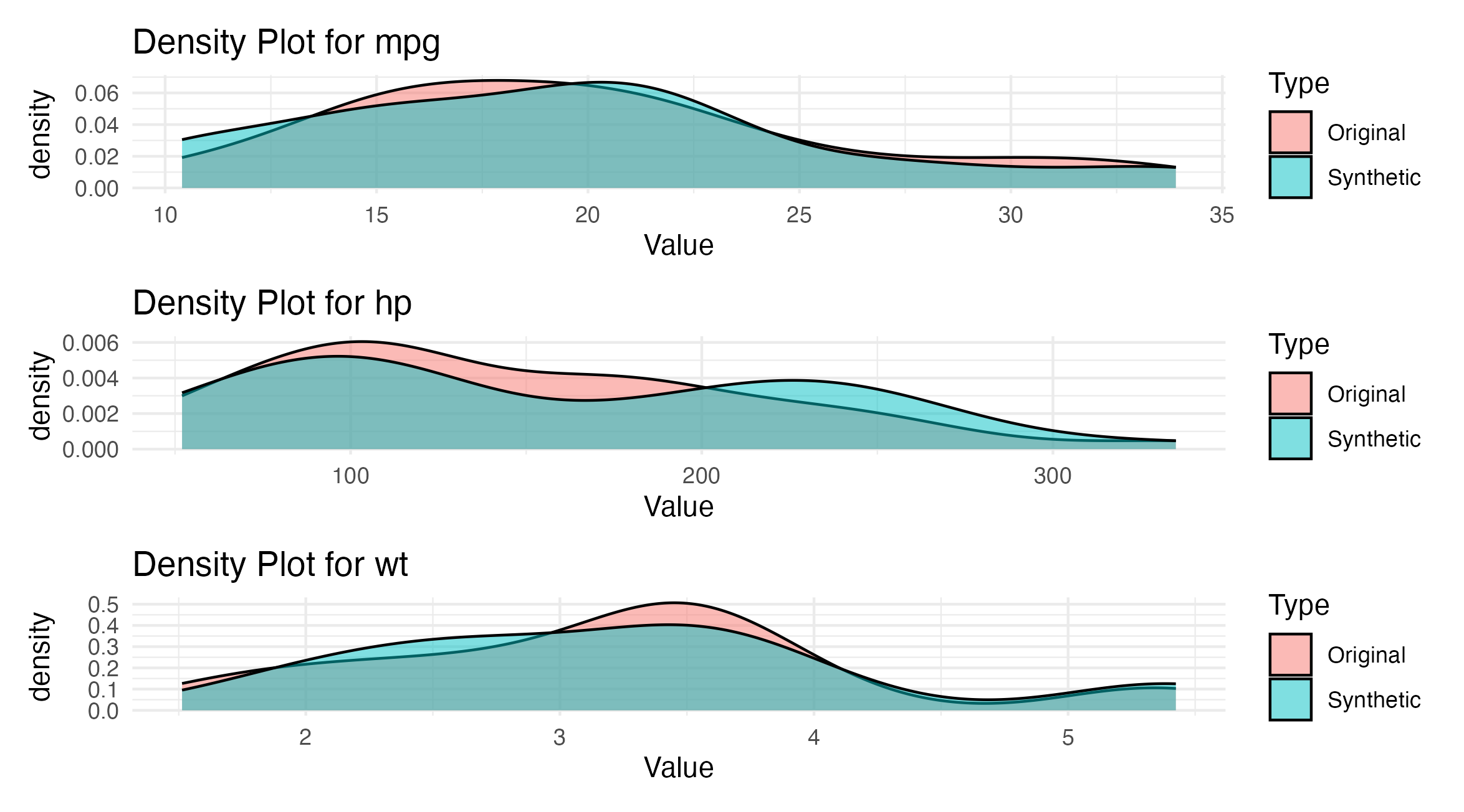
Figure 1: Comparison of numeric data distributions for MPG, HP, and WT between original and synthetic data from the mtcars dataset. Each panel shows a density plot for one variable.
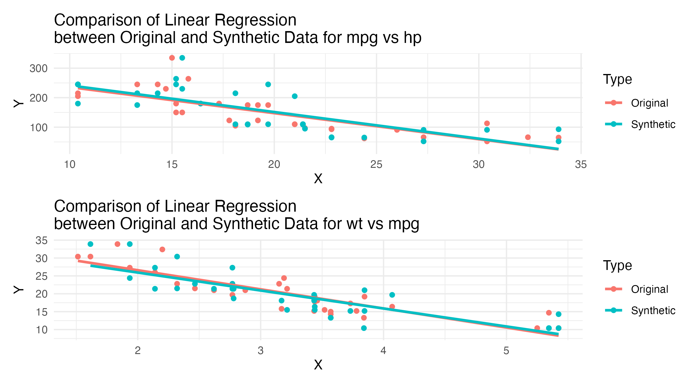
Figure 2: Linear regression comparisons between MPG vs HP and WT vs MPG for original and synthetic mtcars data. Each plot includes a point scatter overlaid with a linear regression line.
library(dplyr)
library(ggplot2)
library(synthpop)
library(patchwork)

# 1. example with mtcars numeric dataset  ----

# Load mtcars dataset
data("mtcars")
df <- mtcars

# Check dimensions of the data: rows and columns
dim(df)

# Check column types
sapply(df, class)

# Create a synthetic version of the dataset
syn_df <- syn(df, seed = 1234)

# Generate synthetic data maintaining the distribution, mean, etc.
synthetic_data <- syn_df$syn

# Print dimensions to confirm they match original data
dim(synthetic_data)

# Generate sample names using sprintf to ensure proper zero padding
synthetic_data$Sample_Names <- sprintf("AAA_%03d", seq_len(nrow(synthetic_data)))

# Function to compare distributions between original and synthetic datasets
compare_plot <- function(original, synthetic, col_name) {
	original_df <- data.frame(Value = original[[col_name]], Type = "Original")
	synthetic_df <- data.frame(Value = synthetic[[col_name]], Type = "Synthetic")

	combined_df <- rbind(original_df, synthetic_df)

	ggplot(combined_df, aes(x = Value, fill = Type)) +
		geom_density(alpha = 0.5) +
		labs(title = paste("Density Plot for", col_name)) +
		theme_minimal()
}

# Create comparison plots for a few example columns
p1 <- compare_plot(df, synthetic_data, "mpg")
p2 <- compare_plot(df, synthetic_data, "hp")
p3 <- compare_plot(df, synthetic_data, "wt")

# save the combined plots
patch1 <- p1 / p2 / p3
ggsave(patch1, file ="./patch1.png")

# Function to compare distributions and regression lines between original and synthetic datasets
compare_plot_with_lm <- function(original, synthetic, x_col, y_col) {
	original_df <- data.frame(X = original[[x_col]], Y = original[[y_col]], Type = "Original")
	synthetic_df <- data.frame(X = synthetic[[x_col]], Y = synthetic[[y_col]], Type = "Synthetic")

	combined_df <- rbind(original_df, synthetic_df)

	ggplot(combined_df, aes(x = X, y = Y, color = Type)) +
		geom_point() +
		geom_smooth(method = "lm", se = FALSE) +
		labs(title = paste("Comparison of Linear Regression\nbetween Original and Synthetic Data for", x_col, "vs", y_col)) +
		theme_minimal()
}

# Example plot for 'mpg' vs 'hp'
p4 <- compare_plot_with_lm(df, synthetic_data, "mpg", "hp")
p5 <- compare_plot_with_lm(df, synthetic_data, "wt", "mpg")

# save the combined plots
patch2 <- p4 / p5
ggsave(patch2, file ="./patch2.png")
2. Example with categorical dataset (iris)
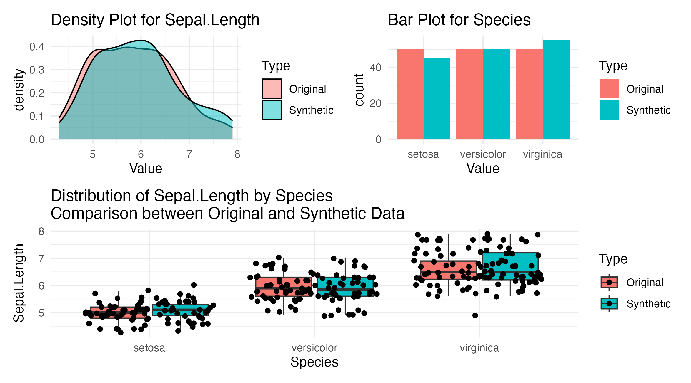
Figure 3: Categorical and numerical data comparison from the iris dataset showing Sepal Length and Species distribution. The top panels are density and bar plots for Sepal Length and Species, respectively. The bottom panel shows a boxplot distribution of Sepal Length across different Species.
# 2. example with iris categorical dataset ----
# Load iris dataset
data("iris")
df <- iris

# Check dimensions of the data: rows and columns
dim(df)

# Check column types
sapply(df, class)

# Convert 'Species' to a factor if not already
df$Species <- as.factor(df$Species)

# Create a synthetic version of the dataset
syn_df <- syn(df, seed = 1234)

# Generate synthetic data maintaining the distribution, mean, etc.
synthetic_data <- syn_df$syn

# Generate sample names using sprintf to ensure proper zero padding
synthetic_data$Sample_Names <- sprintf("BBB_%03d", seq_len(nrow(synthetic_data)))

# Print dimensions to confirm they match original data
dim(synthetic_data)

# Function to compare distributions between original and synthetic datasets
compare_plot <- function(original, synthetic, col_name) {
	original_df <- data.frame(Value = original[[col_name]], Type = "Original")
	synthetic_df <- data.frame(Value = synthetic[[col_name]], Type = "Synthetic")

	combined_df <- rbind(original_df, synthetic_df)

	# Adjust the plot type based on data type
	if(is.numeric(original[[col_name]])) {
		plot <- ggplot(combined_df, aes(x = Value, fill = Type)) +
			geom_density(alpha = 0.5) +
			labs(title = paste("Density Plot for", col_name)) +
			theme_minimal()
	} else {
		plot <- ggplot(combined_df, aes(x = Value, fill = Type)) +
			geom_bar(position = "dodge") +
			labs(title = paste("Bar Plot for", col_name))  +
			theme_minimal()
	}
	print(plot)
}

# Create comparison plots for a few example columns, including the categorical 'Species'
p6 <- compare_plot(df, synthetic_data, "Sepal.Length")
p7 <- compare_plot(df, synthetic_data, "Species")

# save the combined plots
patch3 <- p6 / p7
ggsave(patch3, file ="./patch3.png")

# Function to compare distributions between original and synthetic datasets using boxplots
compare_distribution <- function(original, synthetic, x_col, y_col) {
	original_df <- data.frame(X = original[[x_col]], Y = original[[y_col]], Type = "Original")
	synthetic_df <- data.frame(X = synthetic[[x_col]], Y = synthetic[[y_col]], Type = "Synthetic")

	combined_df <- rbind(original_df, synthetic_df)

	ggplot(combined_df, aes(x = X, y = Y, fill = Type)) +
		geom_boxplot(outlier.shape = NA) + # Hide outliers for clearer comparison
		geom_jitter() + # Add jitter to show data points
		labs(title = paste("Distribution of", y_col, "by", x_col, "\nComparison between Original and Synthetic Data"),
				 x = x_col, y = y_col) +
		theme_minimal()
}

# Compare the distributions of 'Sepal.Length' across 'Species'
p8 <- compare_distribution(df, synthetic_data, "Species", "Sepal.Length")

# save the combined plots
patch3 <- (p6 + p7) / p8
ggsave(patch3, file ="./patch3.png")
3. Example of data with no existing version (medical)
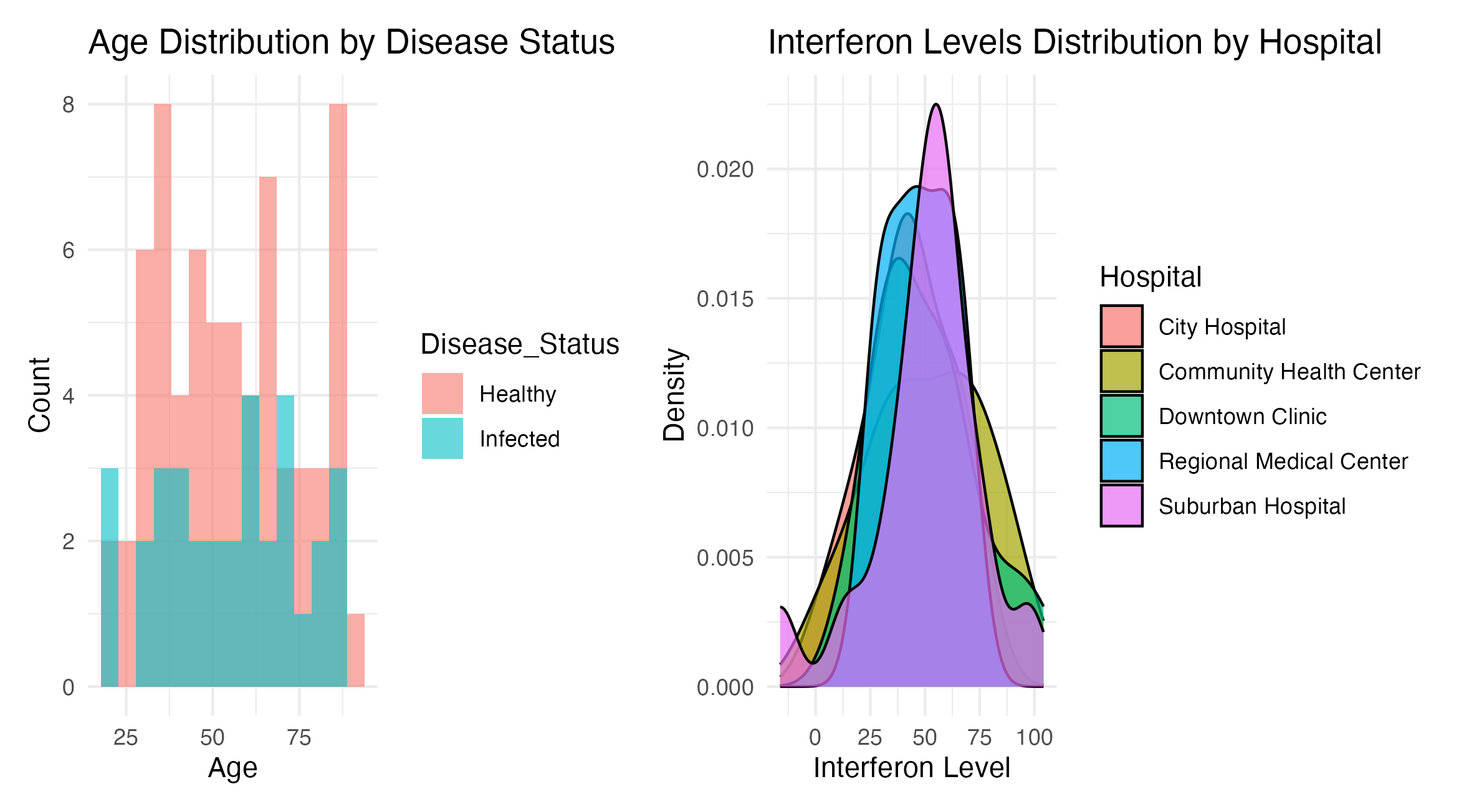
Figure 4: Combined analysis of synthetic healthcare data. Shows the age distribution of patients categorized by disease status, with separate histograms for ‘Healthy’ and ‘Infected’. Displays the distribution of interferon levels across different hospitals.
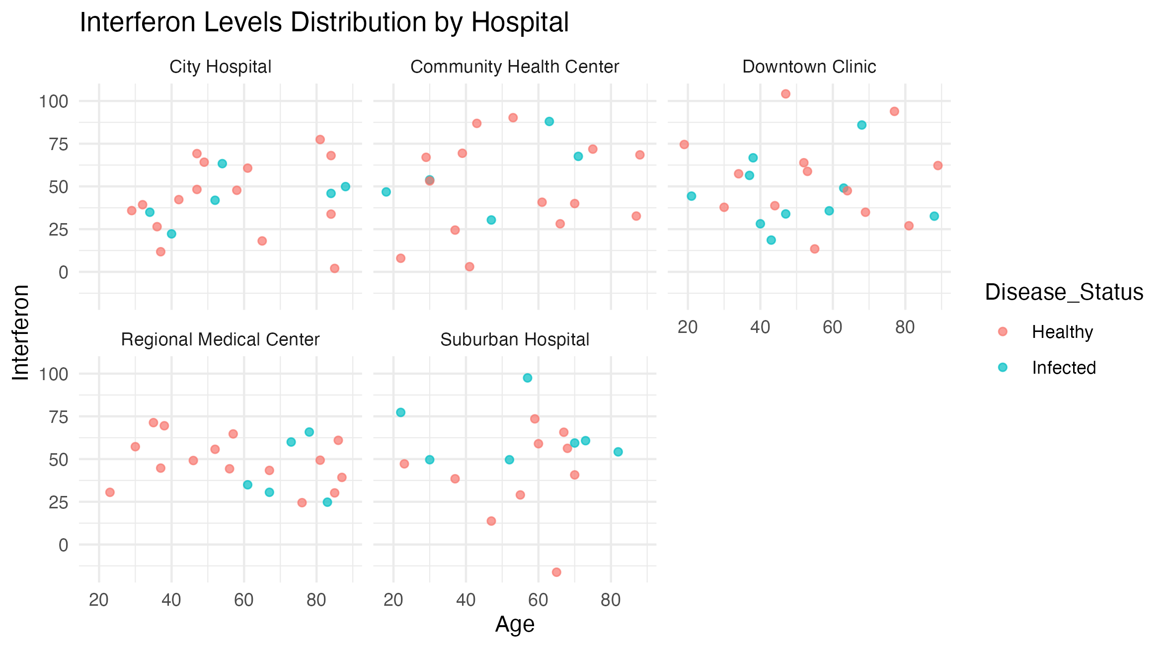
Figure 5: Interferon Levels by Age and Hospital, Colored by Disease Status. This scatter plot displays interferon levels versus age for patients, categorized by disease status and facetted by hospital.
# 3. example of data with no existing version ----

# Define hospital names
hospitals <- c("City Hospital", "Regional Medical Center", "Downtown Clinic", "Suburban Hospital", "Community Health Center")

# Simulate data
set.seed(123)  # for reproducibility
synthetic_data <- data.frame(
	Hospital = sample(hospitals, 100, replace = TRUE),  # Randomly assign hospital names
	Age = round(runif(100, 18, 90)),                    # Random ages between 18 and 90
	Interferon = rnorm(100, 50, 20),                    # Normal distribution of interferon levels
	Disease_Status = sample(c("Healthy", "Infected"), 100, replace = TRUE, prob = c(0.7, 0.3))  # 70% healthy, 30% infected
)

# Generate sample names using sprintf to ensure proper zero padding
synthetic_data$Sample_Names <- sprintf("AAA_%03d", seq_len(nrow(synthetic_data)))

# View the first few rows of the synthetic data
head(synthetic_data)

# Plotting age distribution by disease status
p9 <- ggplot(synthetic_data, aes(x = Age, fill = Disease_Status)) +
	geom_histogram(bins = 15, alpha = 0.6, position = "identity") +
	labs(title = "Age Distribution by Disease Status", x = "Age", y = "Count") +
	theme_minimal()

# Plotting Interferon levels by hospital
p10 <- ggplot(synthetic_data, aes(x = Interferon, fill = Hospital)) +
	geom_density(alpha = 0.7) +
	labs(title = "Interferon Levels Distribution by Hospital", x = "Interferon Level", y = "Density") +
	theme_minimal()

# Plotting Interferon levels by hospital
p11 <- ggplot(synthetic_data, aes(x = Age, y = Interferon, color = Disease_Status)) +
	geom_point(alpha = 0.7) +
	labs(title = "Interferon Levels Distribution by Hospital") +
	facet_wrap(.~Hospital) +
	theme_minimal()

patch4 <- p9 + p10
p11

# Save plots
ggsave("./patch4.png", patch4)
ggsave("./patch5.png", p11)