1 Causal inference - mosquito nets and malaria
Last update:
## [1] "2024-12-31"
This doc was built with: rmarkdown::render("causal_inference_whole_game.Rmd", output_file = "../pages/causal_inference_whole_game.md")
This text is largely copied directly from the following source while we build an example closer to our needs. Please see the original source as follows.
This example is described in the textbook: Causal Inference in R, by Malcolm Barrett, Lucy D’Agostino McGowan, and Travis Gerke. https://www.r-causal.org, chapter 2.
We will use simulated data to answer a more specific question: Does using insecticide-treated bed nets compared to no nets decrease the risk of contracting malaria after 1 year? Data simulated by Dr. Andrew Heiss:
…researchers are interested in whether using mosquito nets decreases an individual’s risk of contracting malaria. They have collected data from 1,752 households in an unnamed country and have variables related to environmental factors, individual health, and household characteristics. The data is not experimental—researchers have no control over who uses mosquito nets, and individual households make their own choices over whether to apply for free nets or buy their own nets, as well as whether they use the nets if they have them.
This data includes a variable that measures the likelihood of contracting malaria, something we wouldn’t likely have in real life. This let’s us know the actual effect size to understand the methods better. The simulated data is in net_data from the {causalworkshop} package, which includes ten variables:
id: an ID variablenetandnet_num: a binary variable indicating if the participant used a net (1) or didn’t use a net (0)malaria_risk: risk of malaria scale ranging from 0-100income: weekly income, measured in dollarshealth: a health score scale ranging from 0–100household: number of people living in the householdeligible: a binary variable indicating if the household is eligible for the free net program.temperature: the average temperature at night, in Celsiusresistance: Insecticide resistance of local mosquitoes. A scale of 0–100, with higher values indicating higher resistance.
The distribution of malaria risk appears to be quite different by net usage.
# devtools::install_github("r-causal/causalworkshop")
library(tidyverse)
library(causalworkshop)
net_data |>
  ggplot(aes(malaria_risk, fill = net)) +
  geom_density(color = NA, alpha = .8)
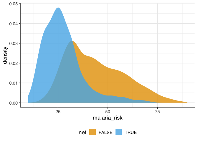
Figure 1.1: A density plot of malaria risk for those who did and did not use nets. The risk of malaria is lower for those who use nets.
In figure 1.1, the density of those who used nets is to the left of those who did not use nets. The mean difference in malaria risk is about 16.4, suggesting net use might be protective against malaria.
net_data |>
  group_by(net) |>
  summarize(malaria_risk = mean(malaria_risk))
## # A tibble: 2 × 2
##   net   malaria_risk
##   <lgl>        <dbl>
## 1 FALSE         43.9
## 2 TRUE          27.5
And that’s what we see with simple linear regression, as well, as we would expect.
library(broom)
net_data |>
  lm(malaria_risk ~ net, data = _) |>
  tidy()
## # A tibble: 2 × 5
##   term        estimate std.error statistic  p.value
##   <chr>          <dbl>     <dbl>     <dbl>    <dbl>
## 1 (Intercept)     43.9     0.377     116.  0
## 2 netTRUE        -16.4     0.741     -22.1 1.10e-95
1.1 Draw our assumptions using a causal diagram
The problem that we face is that other factors may be responsible for the effect we’re seeing. In this example, we’ll focus on confounding: a common cause of net usage and malaria will bias the effect we see unless we account for it somehow. One of the best ways to determine which variables we need to account for is to use a causal diagram. These diagrams, also called causal directed acyclic graphs (DAGs), visualize the assumptions that we’re making about the causal relationships between the exposure, outcome, and other variables we think might be related.
Here’s the DAG that we’re proposing for this question.
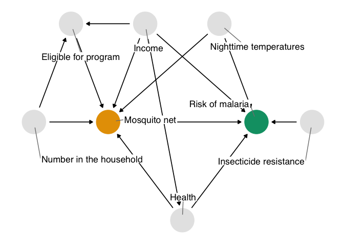
Figure 1.2: A proposed causal diagram of the effect of bed net use on malaria. This directed acyclic graph (DAG) states our assumption that bed net use causes a reduction in malaria risk. It also says that we assume: malaria risk is impacted by net usage, income, health, temperature, and insecticide resistance; net usage is impacted by income, health, temperature, eligibility for the free net program, and the number of people in a household; eligibility for the free net programs is impacted by income and the number of people in a household; and health is impacted by income.
We’ll explore how to create and analyze DAGs in @sec-dags.
In DAGs, each point represents a variable, and each arrow represents a cause. In other words, this diagram declares what we think the causal relationships are between these variables. In figure 1.2, we’re saying that we believe:
- Malaria risk is causally impacted by net usage, income, health, temperature, and insecticide resistance.
- Net usage is causally impacted by income, health, temperature, eligibility for the free net program, and the number of people in a household.
- Eligibility for the free net programs is determined by income and the number of people in a household.
- Health is causally impacted by income.
You may agree or disagree with some of these assertions. That’s a good thing! Laying bare our assumptions allows us to consider the scientific credibility of our analysis. Another benefit of using DAGs is that, thanks to their mathematics, we can determine precisely the subset of variables we need to account for if we assume this DAG is correct.
Assembling DAGs In this exercise, we’re providing you with a reasonable DAG based on knowledge of how the data were generated. In real life, setting up a DAG is a challenge requiring deep thought, domain expertise, and (often) collaboration between several experts.
The chief problem we’re dealing with is that, when we analyze the data we’re working with, we see the impact of net usage on malaria risk and of all these other relationships. In DAG terminology, we have more than one open causal pathway. If this DAG is correct, we have eight causal pathways: the path between net usage and malaria risk and seven other confounding pathways.
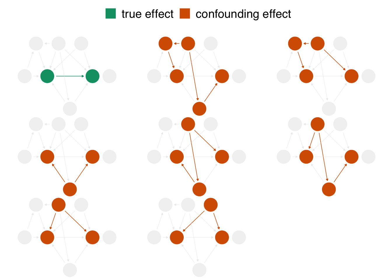
Figure 1.3: In the proposed DAG, there are eight open pathways that contribute to the causal effect seen in the naive regression: the true effect (in green) of net usage on malaria risk and seven other confounding pathways (in orange). The naive estimate is wrong because it is a composite of all these effects.
When we calculate a naive linear regression that only includes net usage and malaria risk, the effect we see is incorrect because the seven other confounding pathways in figure 1.3 distort it. In DAG terminology, we need to block these open pathways that distort the causal estimate we’re after. (We can block paths through several techniques, including stratification, matching, weighting, and more. We’ll see several methods throughout the book.) Luckily, by specifying a DAG, we can precisely determine the variables we need to control for. For this DAG, we need to control for three variables: health, income, and temperature. These three variables are a minimal adjustment set, the minimum set (or sets) of variables you need to block all confounding pathways. We’ll discuss adjustment sets further in @sec-dags.
1.2 Model our assumptions
We’ll use a technique called inverse probability weighting (IPW) to control for these variables, which we’ll discuss in detail in @sec-using-ps. We’ll use logistic regression to predict the probability of treatment—the propensity score. Then, we’ll calculate inverse probability weights to apply to the linear regression model we fit above. The propensity score model includes the exposure—net use—as the dependent variable and the minimal adjustment set as the independent variables.
Modeling the functional form Generally speaking, we want to lean on domain expertise and good modeling practices to fit the propensity score model. For instance, we may want to allow continuous confounders to be non-linear using splines, or we may want to add essential interactions between confounders. Because these are simulated data, we know we don’t need these extra parameters (so we’ll skip them), but in practice, you often do. We’ll discuss this more in @sec-using-ps.
The propensity score model is a logistic regression model with the formula net ~ income + health + temperature, which predicts the probability of bed net usage based on the confounders income, health, and temperature.
propensity_model <- glm(
  net ~ income + health + temperature,
  data = net_data,
  family = binomial()
)

# the first six propensity scores
head(predict(propensity_model, type = "response"))
##      1      2      3      4      5      6
## 0.2464 0.2178 0.3230 0.2307 0.2789 0.3060
We can use propensity scores to control for confounding in various ways. In this example, we’ll focus on weighting. In particular, we’ll compute the inverse probability weight for the average treatment effect (ATE). The ATE represents a particular causal question: what if everyone in the study used bed nets vs. what if no one in the study used bed nets?
To calculate the ATE, we’ll use the broom and propensity packages. broom’s augment() function extracts prediction-related information from the model and joins it to the data. propensity’s wt_ate() function calculates the inverse probability weight given the propensity score and exposure.
For inverse probability weighting, the ATE weight is the inverse of probability of receiving the treatment you actually received. In other words, if you used a bed net, the ATE weight is the inverse of the probability that you used a net, and if you did not use a net, it is the the inverse of the probability that you did not use a net.
library(broom)
library(propensity)
net_data_wts <- propensity_model |>
  augment(data = net_data, type.predict = "response") |>
  # .fitted is the value predicted by the model
  # for a given observation
  mutate(wts = wt_ate(.fitted, net))

net_data_wts |>
  select(net, .fitted, wts) |>
  head()
## # A tibble: 6 × 3
##   net   .fitted   wts
##   <lgl>   <dbl> <dbl>
## 1 FALSE   0.246  1.33
## 2 FALSE   0.218  1.28
## 3 FALSE   0.323  1.48
## 4 FALSE   0.231  1.30
## 5 FALSE   0.279  1.39
## 6 FALSE   0.306  1.44
wts represents the amount each observation will be up-weighted or down-weighted in the outcome model we will soon fit. For instance, the 16th household used a bed net and had a predicted probability of 0.41. That’s a pretty low probability considering they did, in fact, use a net, so their weight is higher at 2.42. In other words, this household will be up-weighted compared to the naive linear model we fit above. The first household did not use a bed net; they’re predicted probability of net use was 0.25 (or put differently, a predicted probability of not using a net of 0.75). That’s more in line with their observed value of net, but there’s still some predicted probability of using a net, so their weight is 1.28.
1.3 Diagnose our models
The goal of propensity score weighting is to weight the population of observations such that the distribution of confounders is balanced between the exposure groups. Put another way, we are, in principle, removing the arrows between the confounders and exposure in the DAG, so that the confounding paths no longer distort our estimates. Here’s the distribution of the propensity score by group, created by geom_mirror_histogram() from the halfmoon package for assessing balance in propensity score models:
library(halfmoon)
ggplot(net_data_wts, aes(.fitted)) +
  geom_mirror_histogram(
    aes(fill = net),
    bins = 50
  ) +
  scale_y_continuous(labels = abs) +
  labs(x = "propensity score")
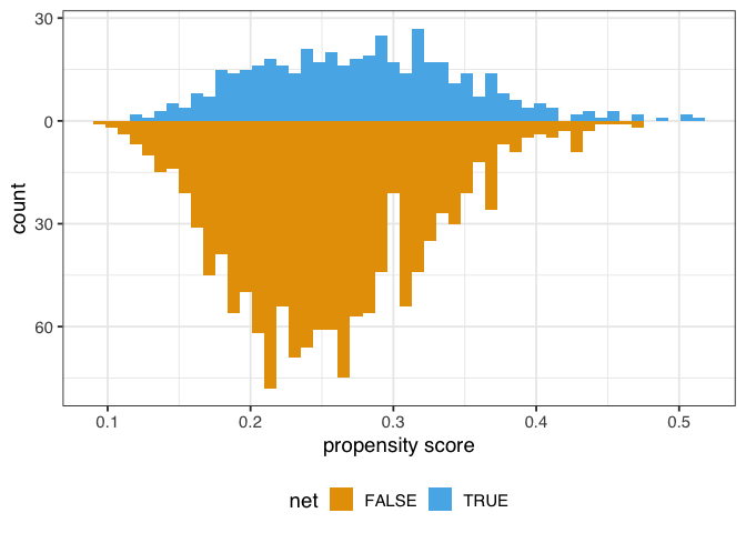
Figure 1.4: A mirrored histogram of the propensity scores of those who used nets (top, blue) versus those who did not use nets (bottom, orange). The range of propensity scores is similar between groups, with those who used nets slightly to the left of those who didn’t, but the shapes of the distribution are different.
The weighted propensity score creates a pseudo-population where the distributions are much more similar:
ggplot(net_data_wts, aes(.fitted)) +
  geom_mirror_histogram(
    aes(group = net),
    bins = 50
  ) +
  geom_mirror_histogram(
    aes(fill = net, weight = wts),
    bins = 50,
    alpha = .5
  ) +
  scale_y_continuous(labels = abs) +
  labs(x = "propensity score")
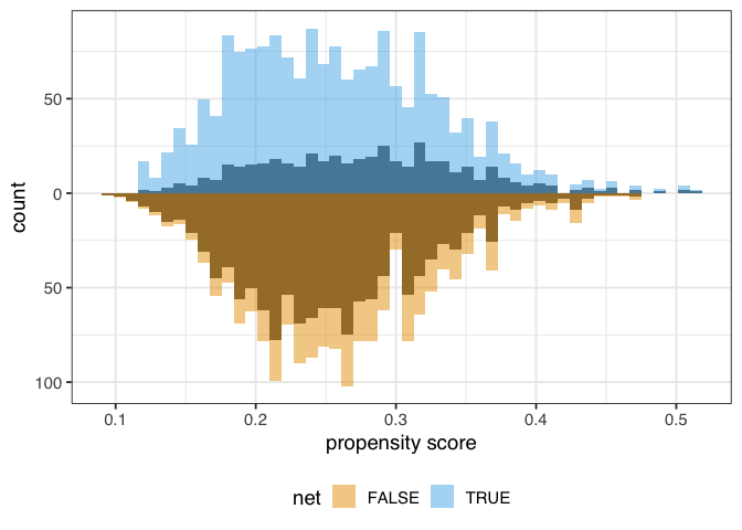
Figure 1.5: A mirrored histogram of the propensity scores of those who used nets (top, blue) versus those who did not use nets (bottom, orange). The shaded region represents the unweighted distribution, and the colored region represents the weighted distributions. The ATE weights up-weight the groups to be similar in range and shape of the distribution of propensity scores.
In this example, the unweighted distributions are not awful—the shapes are somewhat similar here, and they overlap quite a bit—but the weighted distributions in figure 1.4 are much more similar.
Unmeasured confounding Propensity score weighting and most other causal inference techniques only help with observed confounders—ones that we model correctly, at that. Unfortunately, we still may have unmeasured confounding, which we’ll discuss below. Randomization is one causal inference technique that does deal with unmeasured confounding, one of the reasons it is so powerful.
We might also want to know how well-balanced the groups are by each confounder. One way to do this is to calculate the standardized mean differences (SMDs) for each confounder with and without weights. We’ll calculate the SMDs with tidy_smd() then plot them with geom_love().
plot_df <- tidy_smd(
  net_data_wts,
  c(income, health, temperature),
  .group = net,
  .wts = wts
)

ggplot(
  plot_df,
  aes(
    x = abs(smd),
    y = variable,
    group = method,
    color = method
  )
) +
  geom_love()
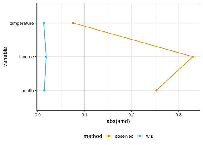
Figure 1.6: A love plot representing the standardized mean differences (SMD) between exposure groups of three confounders: temperature, income, and health. Before weighting, there are considerable differences in the groups. After weighting, the confounders are much more balanced between groups.
A standard guideline is that balanced confounders should have an SMD of less than 0.1 on the absolute scale. 0.1 is just a rule of thumb, but if we follow it, the variables in figure 1.6 are well-balanced after weighting (and unbalanced before weighting).
Before we apply the weights to the outcome model, let’s check their overall distribution for extreme weights. Extreme weights can destabilize the estimate and variance in the outcome model, so we want to be aware of it. We’ll also discuss several other types of weights that are less prone to this issue in @sec-estimands.
net_data_wts |>
  ggplot(aes(wts)) +
  geom_density(fill = "#CC79A7", color = NA, alpha = 0.8)
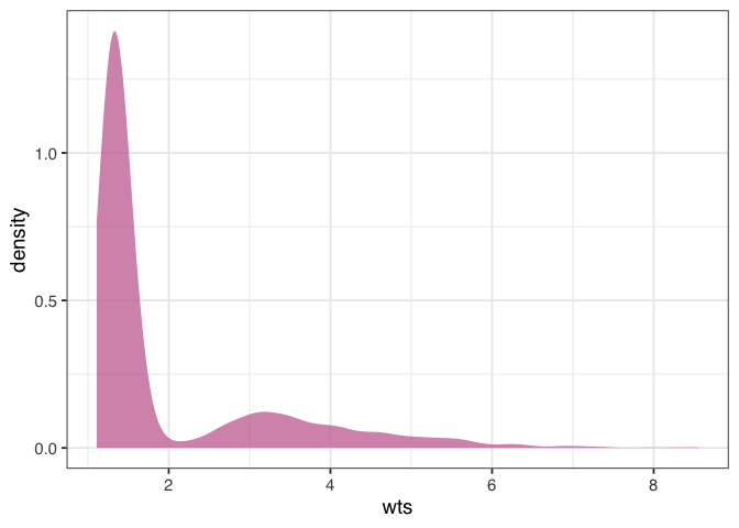
Figure 1.7: A density plot of the average treatment effect (ATE) weights. The plot is skewed, with higher values towards 8. This may indicate a problem with the model, but the weights aren’t so extreme to destabilize the variance of the estimate.
The weights in figure 1.7 are skewed, but there are no outrageous values. If we saw extreme weights, we might try trimming or stabilizing them, or consider calculating an effect for a different estimand, which we’ll discuss in @sec-estimands. It doesn’t look like we need to do that here, however.
1.4 Estimate the causal effect
We’re now ready to use the ATE weights to (attempt to) account for confounding in the naive linear regression model. Fitting such a model is pleasantly simple in this case: we fit the same model as before but with weights = wts, which will incorporate the inverse probability weights.
net_data_wts |>
  lm(malaria_risk ~ net, data = _, weights = wts) |>
  tidy(conf.int = TRUE)
## # A tibble: 2 × 7
##   term   estimate std.error statistic  p.value conf.low
##   <chr>     <dbl>     <dbl>     <dbl>    <dbl>    <dbl>
## 1 (Inte…     42.7     0.442      96.7 0            41.9
## 2 netTR…    -12.5     0.624     -20.1 5.50e-81    -13.8
## # ℹ 1 more variable: conf.high <dbl>
The estimate for the average treatment effect is -12.5 (95% CI -13.8, -11.3). Unfortunately, the confidence intervals we’re using are wrong because they don’t account for the uncertainty in estimating the weights. Generally, confidence intervals for propensity score weighted models will be too narrow unless we account for this uncertainty. The nominal coverage of the confidence intervals will thus be wrong (they aren’t 95% CIs because their coverage is much lower than 95%) and may lead to misinterpretation.
We’ve got several ways to address this problem, which we’ll discuss in detail in @sec-outcome-model, including the bootstrap, robust standard errors, and manually accounting for the estimation procedure with empirical sandwich estimators. For this example, we’ll use the bootstrap, a flexible tool that calculates distributions of parameters using re-sampling. The bootstrap is a useful tool for many causal models where closed-form solutions to problems (particularly standard errors) don’t exist or when we want to avoid parametric assumptions inherent to many such solutions; see @sec-appendix-bootstrap for a description of what the bootstrap is and how it works. We’ll use the rsample package from the tidymodels ecosystem to work with bootstrap samples.
Because the bootstrap is so flexible, we need to think carefully about the sources of uncertainty in the statistic we’re calculating. It might be tempting to write a function like this to fit the statistic we’re interested in (the point estimate for netTRUE):
library(rsample)

fit_ipw_not_quite_rightly <- function(.split, ...) {
  # get bootstrapped data frame
  .df <- as.data.frame(.split)

  # fit ipw model
  lm(malaria_risk ~ net, data = .df, weights = wts) |>
    tidy()
}
However, this function won’t give us the correct confidence intervals because it treats the inverse probability weights as fixed values. They’re not, of course; we just estimated them using logistic regression! We need to account for this uncertainty by bootstrapping the entire modeling process. For every bootstrap sample, we need to fit the propensity score model, calculate the inverse probability weights, then fit the weighted outcome model.
library(rsample)

fit_ipw <- function(.split, ...) {
  # get bootstrapped data frame
  .df <- as.data.frame(.split)

  # fit propensity score model
  propensity_model <- glm(
    net ~ income + health + temperature,
    data = .df,
    family = binomial()
  )

  # calculate inverse probability weights
  .df <- propensity_model |>
    augment(type.predict = "response", data = .df) |>
    mutate(wts = wt_ate(.fitted, net))

  # fit correctly bootstrapped ipw model
  lm(malaria_risk ~ net, data = .df, weights = wts) |>
    tidy()
}
Now that we know precisely how to calculate the estimate for each iteration let’s create the bootstrapped dataset with rsample’s bootstraps() function. The times argument determines how many bootstrapped datasets to create; we’ll do 1,000.
bootstrapped_net_data <- bootstraps(
  net_data,
  times = 1000,
  # required to calculate CIs later
  apparent = TRUE
)

bootstrapped_net_data
## # Bootstrap sampling with apparent sample
## # A tibble: 1,001 × 2
##    splits             id
##    <list>             <chr>
##  1 <split [1752/646]> Bootstrap0001
##  2 <split [1752/637]> Bootstrap0002
##  3 <split [1752/621]> Bootstrap0003
##  4 <split [1752/630]> Bootstrap0004
##  5 <split [1752/644]> Bootstrap0005
##  6 <split [1752/650]> Bootstrap0006
##  7 <split [1752/631]> Bootstrap0007
##  8 <split [1752/627]> Bootstrap0008
##  9 <split [1752/637]> Bootstrap0009
## 10 <split [1752/631]> Bootstrap0010
## # ℹ 991 more rows
The result is a nested data frame: each splits object contains metadata that rsample uses to subset the bootstrap samples for each of the 1,000 samples. We actually have 1,001 rows because apparent = TRUE keeps a copy of the original data frame, as well, which is needed for some times of confidence interval calculations. Next, we’ll run fit_ipw() 1,001 times to create a distribution for estimate. At its heart, the calculation we’re doing is
fit_ipw(bootstrapped_net_data$splits[[n]])
Where n is one of 1,001 indices. We’ll use purrr’s map() function to iterate across each split object.
ipw_results <- bootstrapped_net_data |>
  mutate(boot_fits = map(splits, fit_ipw))

ipw_results
## # Bootstrap sampling with apparent sample
## # A tibble: 1,001 × 3
##    splits             id            boot_fits
##    <list>             <chr>         <list>
##  1 <split [1752/646]> Bootstrap0001 <tibble [2 × 5]>
##  2 <split [1752/637]> Bootstrap0002 <tibble [2 × 5]>
##  3 <split [1752/621]> Bootstrap0003 <tibble [2 × 5]>
##  4 <split [1752/630]> Bootstrap0004 <tibble [2 × 5]>
##  5 <split [1752/644]> Bootstrap0005 <tibble [2 × 5]>
##  6 <split [1752/650]> Bootstrap0006 <tibble [2 × 5]>
##  7 <split [1752/631]> Bootstrap0007 <tibble [2 × 5]>
##  8 <split [1752/627]> Bootstrap0008 <tibble [2 × 5]>
##  9 <split [1752/637]> Bootstrap0009 <tibble [2 × 5]>
## 10 <split [1752/631]> Bootstrap0010 <tibble [2 × 5]>
## # ℹ 991 more rows
The result is another nested data frame with a new column, boot_fits. Each element of boot_fits is the result of the IPW for the bootstrapped dataset. For example, in the first bootstrapped data set, the IPW results were:
ipw_results$boot_fits[[1]]
## # A tibble: 2 × 5
##   term        estimate std.error statistic  p.value
##   <chr>          <dbl>     <dbl>     <dbl>    <dbl>
## 1 (Intercept)     42.7     0.465      91.9 0
## 2 netTRUE        -11.8     0.657     -18.0 1.04e-66
Now we have a distribution of estimates:
ipw_results |>
  # remove original data set results
  filter(id != "Apparent") |>
  mutate(
    estimate = map_dbl(
      boot_fits,
      # pull the `estimate` for `netTRUE` for each fit
      \(.fit) .fit |>
        filter(term == "netTRUE") |>
        pull(estimate)
    )
  ) |>
  ggplot(aes(estimate)) +
  geom_histogram(fill = "#D55E00FF", color = "white", alpha = 0.8)
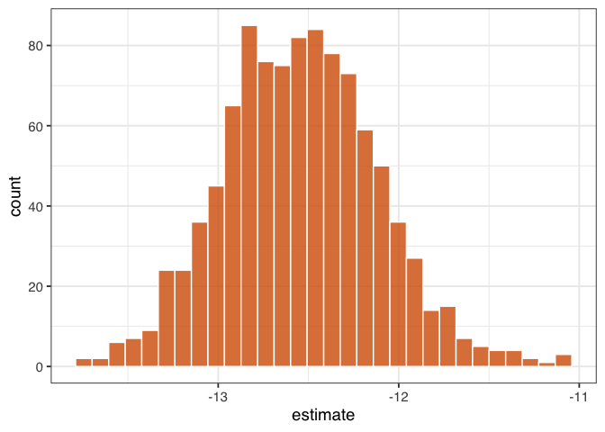
Figure 1.8: “A histogram of 1,000 bootstrapped estimates of the effect of net use on malaria risk. The spread of these estimates accounts for the dependency and uncertainty in the use of IPW weights.”
Figure figure 1.8 gives a sense of the variation in estimate, but let’s calculate 95% confidence intervals from the bootstrapped distribution using rsample’s int_t() :
boot_estimate <- ipw_results |>
  # calculate T-statistic-based CIs
  int_t(boot_fits) |>
  filter(term == "netTRUE")

boot_estimate
## # A tibble: 1 × 6
##   term    .lower .estimate .upper .alpha .method
##   <chr>    <dbl>     <dbl>  <dbl>  <dbl> <chr>
## 1 netTRUE  -13.4     -12.5  -11.7   0.05 student-t
Now we have a confounder-adjusted estimate with correct standard errors. The estimate of the effect of all households using bed nets versus no households using bed nets on malaria risk is -12.5 (95% CI -13.4, -11.7). Bed nets do indeed seem to reduce malaria risk in this study.
1.5 Conduct sensitivity analysis on the effect estimate
We’ve laid out a roadmap for taking observational data, thinking critically about the causal question we want to ask, identifying the assumptions we need to get there, then applying those assumptions to a statistical model. Getting the correct answer to the causal question relies on getting our assumptions more or less right. But what if we’re more on the less correct side?
Spoiler alert: the answer we just calculated is wrong. After all that effort!
When conducting a causal analysis, it’s a good idea to use sensitivity analyses to test your assumptions. There are many potential sources of bias in any study and many sensitivity analyses to go along with them (@sec-sensitivity); here, we’ll focus on the assumption of no confounding.
Let’s start with a broad sensitivity analysis; then, we’ll ask questions about specific unmeasured confounders. When we have less information about unmeasured confounders, we can use tipping point analysis to ask how much confounding it would take to tip my estimate to the null. In other words, what would the strength of the unmeasured confounder have to be to explain our results away? The tipr package is a toolkit for conducting sensitivity analyses. Let’s examine the tipping point for an unknown, normally-distributed confounder. The tip_coef() function takes an estimate (a beta coefficient from a regression model, or the upper or lower bound of the coefficient). It further requires either the 1) scaled differences in means of the confounder between exposure groups or 2) effect of the confounder on the outcome. For the estimate, we’ll use conf.high, which is closer to 0 (the null), and ask: how much would the confounder have to affect malaria risk to have an unbiased upper confidence interval of 0? We’ll use tipr to calculate this answer for 5 scenarios, where the mean difference in the confounder between exposure groups is 1, 2, 3, 4, or 5.
library(tipr)
tipping_points <- tip_coef(boot_estimate$.upper, exposure_confounder_effect = 1:5)

tipping_points |>
  ggplot(aes(confounder_outcome_effect, exposure_confounder_effect)) +
  geom_line(color = "#009E73", linewidth = 1.1) +
  geom_point(fill = "#009E73", color = "white", size = 2.5, shape = 21) +
  labs(
    x = "Confounder-Outcome Effect",
    y = "Scaled mean differences in\n confounder between exposure groups"
  )
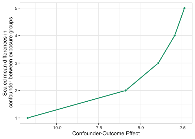
Figure 1.9: A tipping point analysis under several confounding scenarios where the unmeasured confounder is a normally-distributed continuous variable. The line represents the strength of confounding necessary to tip the upper confidence interval of the causal effect estimate to 0. The x-axis represents the coefficient of the confounder-outcome relationship adjusted for the exposure and the set of measured confounders. The y-axis represents the scaled mean difference of the confounder between exposure groups.
If we had an unmeasured confounder where the standardized mean difference between exposure groups was 1, the confounder would need to decrease malaria risk by about -11.7. That’s pretty strong relative to other effects, but it may be feasible if we have an idea of something we might have missed. Conversely, suppose the relationship between net use and the unmeasured confounder is very strong, with a mean scaled difference of 5. In that case, the confounder-malaria relationship only needs to be -2.3. Now we have to consider: which of these scenarios are plausible given our domain knowledge and the effects we see in this analysis?
Now let’s consider a much more specific sensitivity analysis. Some ethnic groups, such as the Fulani, have a genetic resistance to malaria [@arama2015]. Let’s say that in our simulated data, an unnamed ethnic group in the unnamed country shares this genetic resistance to malaria. For historical reasons, bed net use in this group is also very high. We don’t have this variable in net_data, but let’s say we know from the literature that in this sample, we can estimate at:
- People with this genetic resistance have, on average, a lower malaria risk by about 10.
- About 26% of people who use nets in our study have this genetic resistance.
- About 5% of people who don’t use nets have this genetic resistance.
With this amount of information, we can use tipr to adjust the estimates we calculated for the unmeasured confounder. We’ll use adjust_coef_with_binary() to calculate the adjusted estimates.
adjusted_estimates <- boot_estimate |>
  select(.estimate, .lower, .upper) |>
  unlist() |>
  adjust_coef_with_binary(
    exposed_confounder_prev = 0.26,
    unexposed_confounder_prev = 0.05,
    confounder_outcome_effect = -10
  )

adjusted_estimates
## # A tibble: 3 × 4
##   effect_adjusted effect_observed
##             <dbl>           <dbl>
## 1          -10.4            -12.5
## 2          -11.3            -13.4
## 3           -9.63           -11.7
## # ℹ 2 more variables:
## #   exposure_confounder_effect <dbl>,
## #   confounder_outcome_effect <dbl>
The adjusted estimate for a situation where genetic resistance to malaria is a confounder is -10.4 (95% CI -11.3, -9.6).
In fact, these data were simulated with just such a confounder. The true effect of net use on malaria is about -10, and the true DAG that generated these data is:
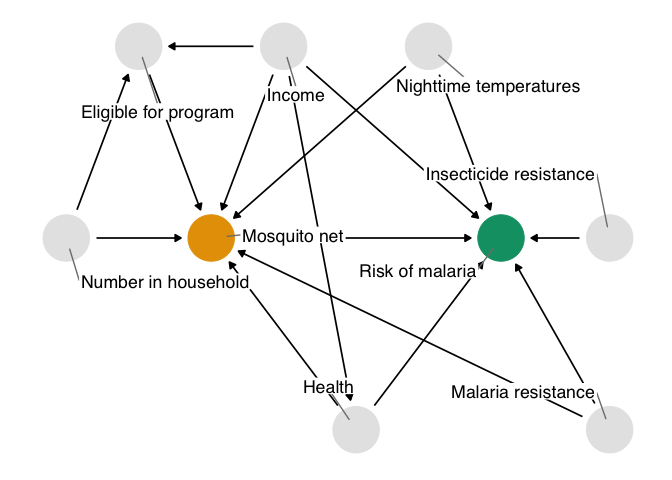
Figure 1.10: The true causal diagram for `net_data`. This DAG is identical to the one we proposed with one addition: genetic resistance to malaria causally reduces the risk of malaria and impacts net use. It’s thus a confounder and a part of the minimal adjustment set required to get an unbiased effect estimate. In otherwords, by not including it, we’ve calculated the wrong effect.
The unmeasured confounder in figure 1.10 is available in the dataset net_data_full as genetic_resistance. If we recalculate the IPW estimate of the average treatment effect of nets on malaria risk, we get -10.3 (95% CI -11.2, -9.3), much closer to the actual answer of -10.
What do you think? Is this estimate reliable? Did we do a good job addressing the assumptions we need to make for a causal effect, mainly that there is no confounding? How might you criticize this model, and what would you do differently? Ok, we know that -10 is the correct answer because the data are simulated, but in practice, we can never be sure, so we need to continue probing our assumptions until we’re confident they are robust. We’ll explore these techniques and others in @sec-sensitivity.
To calculate this effect, we:
- Specified a causal question (for the average treatment effect)
- Drew our assumptions using a causal diagram (using DAGs)
- Modeled our assumptions (using propensity score weighting)
- Diagnosed our models (by checking confounder balance after weighting)
- Estimated the causal effect (using inverse probability weighting)
- Conducted sensitivity analysis on the effect estimate (using tipping point analysis)
We can dive more deeply into propensity score techniques, explore other methods for estimating causal effects, and, most importantly, make sure that the assumptions we’re making are reasonable, even if we’ll never know for sure.