Last update: 20230425
Aggregated Cauchy Association Test (ACAT)
- Aggregated Cauchy Association Test (ACAT)
- Abbreviations
- Intro to this topic
- Papers
- Step-by-step explanation of ACAT.R
- Applying STAAR-O for multiple annotation weights
- Non-gene-centric analysis using dynamic windows with SCANG-STAAR
- Multi-weight annotation analysis
- Main equations for ACAT
- tan and \(\pi\)
- Original R code from yaowuliu
- Example exercise
- R code examples
Abbreviations
- ACAT: Aggregated Cauchy Association Test
- ACAT-V: Aggregated Cauchy Association Test - Variant level
- ACAT-O: Aggregated Cauchy Association Test - Omnibus
- SKAT: Sequence Kernel Association Test
- ARIC: Atherosclerosis Risk in Communities
Intro to this topic
The Aggregated Cauchy Association Test (ACAT) is a statistical method used for rare-variant association tests (RVATs) in genetic studies. ACAT is designed to aggregate the association signals of multiple rare genetic variants within a genomic region or a gene, while accounting for the directions of the effects of these variants on the phenotype of interest. The ACAT method utilizes a Cauchy distribution, which allows for improved performance in identifying true associations, especially when the directions and magnitudes of variant effects are heterogeneous.
First, here is a great talk by author of SKAT and other methods:
Watch on YouTube Dr. Xihong Lin: Overview of Rare Variant Analysis of Whole Genome Sequencing Association Studies.
- The major part starts at time: 22:30
- and the best is at: 30:50 where she describes the aggregated Cauchy association test (ACAT) method for combining multiple annotations (like CADD score, MAF, etc.) to calculate the final P-value.
- This is their annotation database discussed: https://favor.genohub.org
Papers
- ACAT paper, Yaowu Liu, et al AJGH 2019.
- Application of STAAR protocol to TOPMed, Xihao Li, et al. NatGen 2020.
- STAAR pipeline methods paper, Zilin Li, et al. NatMethods 2022.
- STAAR pipeline github
- Controlling SKAT function: Here’s a summary of the SKAT package functions - which are easier to understand than reading the notation in the SKAT papers. If you read the code you see each new implement is added sequentially and how weights work. Although, the ACAT git repo is independent.
- ACAT git repo: https://github.com/yaowuliu/ACAT/blob/master/R/ACAT.R
Step-by-step explanation of ACAT.R
This discussion refers to code in the main ACAT function found at https://github.com/yaowuliu/ACAT.
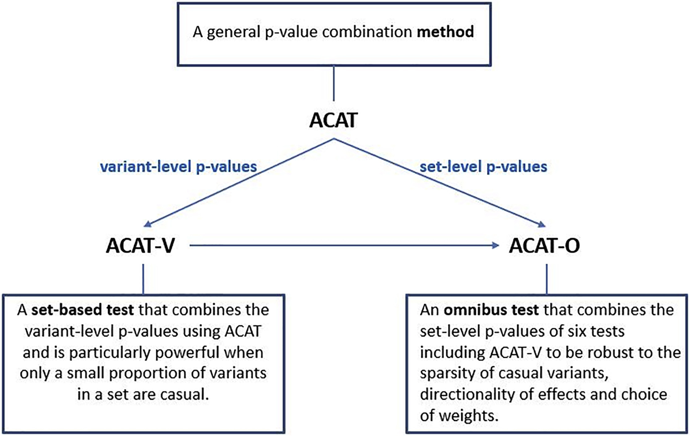
Figure 1. Summary of the Proposed Methods ACAT, ACAT-V, and ACAT-O and the Relationship Among Them. From the ACAT paper
- The R code defines several functions to perform the Aggregated Cauchy Association Test (ACAT) and the ACAT-V test.
ACAT: This function combines p-values using the Cauchy distribution.ACAT_V: A set-based test that uses ACAT to combine the variant-level p-values.NULL_Model: Computes model parameters and residuals for ACAT-V.Get.marginal.pval: A helper function to calculate the marginal p-values for ACAT-V.
ACATfunction- a. It accepts
Pvals(p-values),weights, and an optionalis.check parameterto validate the input. - b. Checks for NA, p-value range (0 to 1), and existence of both 0 and 1 p-values in the same column.
- c. If weights are not provided, equal weights are used. Otherwise, user-supplied weights are validated and standardized.
- d. The function calculates the Cauchy statistics and returns the ACAT p-value(s).
- a. It accepts
ACAT_Vfunction- a. It accepts
G(genotype matrix),obj(output object ofNULL_Model),weights.beta,weights, andmac.thresh. - b. It checks for the validity of input weights.
- c. Based on the
mac.threshvalue, it decides to use the Burden test, the Cauchy method, or a combination of both. - d. It calculates the final p-value and returns it.
- a. It accepts
NULL_Modelfunction- a. It accepts
Y(outcome phenotypes) andZ(covariates). - b. It determines if
Yis continuous or binary. - c. It fits a linear regression model if
Yis continuous and a logistic model ifYis binary. - d. It returns an object with model parameters and residuals.
- a. It accepts
Get.marginal.pvalfunction- a. It accepts
G(genotype matrix) andobj(output object ofNULL_Model). - b. It checks the validity of the
objinput. - c. It calculates the marginal p-values and returns them.
- a. It accepts
The Aggregated Cauchy Association Test (ACAT) is a powerful and computationally efficient method designed to improve the analysis of rare and low-frequency genetic variants in sequencing studies. Traditional set-based tests can experience power loss when only a small proportion of variants are causal, and their power can be sensitive to factors such as the number, effect sizes, and effect directions of causal variants, as well as weight choices.
ACAT addresses these issues by combining variant-level p-values to create a set-based test called ACAT-V. ACAT-V is particularly powerful when there are only a few causal variants in a set, making it a valuable tool for genetic analysis. Additionally, ACAT can be used to create an omnibus test called ACAT-O by combining different variant-set-level p-values. ACAT-O incorporates the strengths of multiple complementary set-based tests, such as the burden test, sequence kernel association test (SKAT), and ACAT-V.
By analyzing extensive simulated data and real-world data from the Atherosclerosis Risk in Communities (ARIC) study, it has been demonstrated that ACAT-V complements other tests like SKAT and the burden test. Furthermore, ACAT-O consistently delivers more robust and higher power than alternative tests, making it a valuable addition to the toolkit of researchers working with sequencing studies.
ACAT is designed to combine p-values from multiple variants or tests rather than combining annotation scores directly. If you have p-values associated with each of the 5 annotation columns (CADD_score, MAF, GnomAD_AF, REVEL_score, ClinVar_score) for a single variant, you could potentially use ACAT to combine these p-values to obtain a single combined p-value for that variant. However, it’s essential to ensure that the p-values are valid and independent for ACAT to be effective.
To do this see the STAAR framework for this.
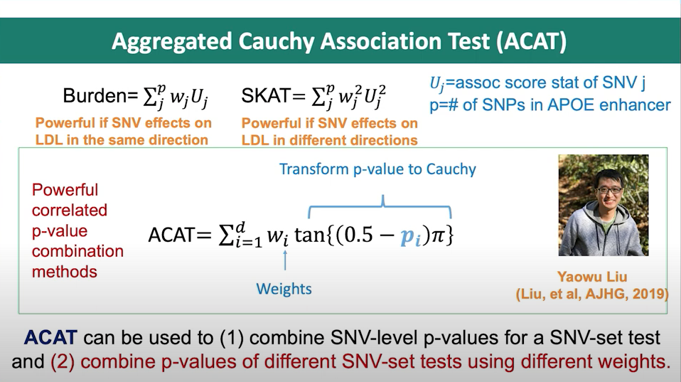
Figure 2. Slide from presentation of ACAT method.
Applying STAAR-O for multiple annotation weights
In a separate page, I discuss the STAAR method. The following passages are included in both pages since they related.
In the STAAR Nature Methods paper, the section Gene-centric analysis of the noncoding genome shows how the STAAR method can indeed be used to capitalize on the ACAT method to obtain a combined p-value from a set of annotations for a single variant. The STAAR framework incorporates multiple functional annotation scores into the RVATs (rare-variant association tests) to increase the power of association analysis. In this context, it uses the STAAR-O test, an omnibus test that aggregates annotation-weighted burden test, SKAT, and ACAT-V within the STAAR framework.
By incorporating multiple functional annotation scores, such as CADD, LINSIGHT, FATHMM-XF, and annotation principal components (aPCs), the STAAR method enhances the ability to detect associations between variants and traits of interest. Therefore, the STAAR framework can be used to leverage the strengths of the ACAT method and obtain a combined p-value from a set of annotations for a single variant or a set of variants.
Non-gene-centric analysis using dynamic windows with SCANG-STAAR
The SCANG-STAAR method is an improvement over the fixed-size sliding window RVAT in the STAAR framework. It proposes a dynamic window-based approach called SCANG-STAAR, which extends the SCANG procedure by incorporating multidimensional functional annotations. This method allows for flexible detection of locations and sizes of signal windows across the genome, as the locations of regions associated with a disease or trait are often unknown in advance, and their sizes may vary across the genome. Using a prespecified fixed-size sliding window for RVAT can lead to power loss if the prespecified window sizes do not align with the true locations of the signals.
The SCANG-STAAR method has two main procedures: SCANG-STAAR-S and SCANG-STAAR-B. SCANG-STAAR-S extends the SCANG-SKAT (SCANG-S) procedure by calculating the STAAR-SKAT (STAAR-S) p-value in each overlapping window by incorporating multiple variant functional annotations, instead of using just the MAF-weight-based SKAT p-value. SCANG-STAAR-B is based on the STAAR-Burden p-value. SCANG-STAAR-S has two advantages over SCANG-STAAR-B in detecting noncoding associations using dynamic windows: first, the effects of causal variants in a neighborhood in the noncoding genome tend to be in different directions, especially in intergenic regions; second, due to the different correlation structures of the two test statistics for overlapping windows, the genome-wide significance threshold of SCANG-STAAR-B is lower than that of SCANG-STAAR-S.
SCANG-STAAR also provides the SCANG-STAAR-O procedure, based on an omnibus p-value of SCANG-STAAR-S and SCANG-STAAR-B calculated by the ACAT method. However, unlike STAAR-O, the ACAT-V test is not incorporated into the omnibus test because it is designed for sparse alternatives, and as a result, it tends to detect the region with the smallest size that contains the most significant variant in the dynamic window procedure.
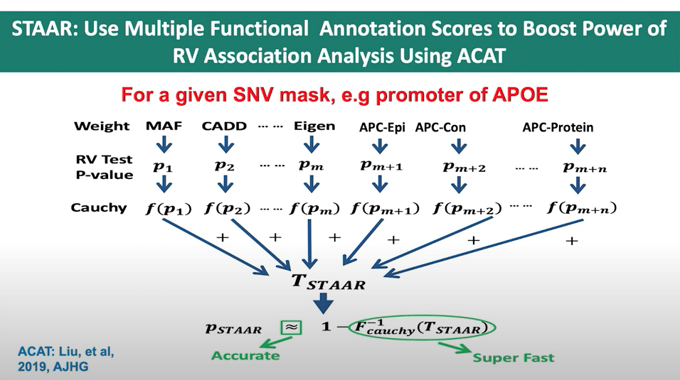
Figure 3. Slide from presentation of ACAT application in STAAR.
Multi-weight annotation analysis
The STAAR framework can be used to combine the p-values associated with each of the 5 annotation columns (CADD_score, MAF, GnomAD_AF, REVEL_score, ClinVar_score) for a single variant. STAAR incorporates multiple functional annotation scores as weights when constructing its statistics, making it suitable for combining p-values from different annotation columns to obtain a single combined p-value for that variant.
Main equations for ACAT
- ACAT test statistic:
where \(p_i\) are the p-values, and \(w_i\) are non-negative weights.
- P-value calculation for the ACAT test statistic:
where \(w = \sum_{i=1}^{k} w_i\).
- ACAT is a general and flexible method of combining p-values, which can represent the statistical significance of different kinds of genetic variations in sequencing studies.
- ACAT only aggregates p-values, so one can automatically control cryptic relatedness and/or population stratification by fitting appropriate models from which p-values are calculated through methods such as principal-component analysis or mixed models.
- The null distribution of the test statistic \(T_{ACAT}\) can be well approximated by a Cauchy distribution without the need for estimating and accounting for the correlation among p-values.
- Calculating the p-value of ACAT requires almost negligible computation and is extremely fast.
- The approximation is particularly accurate when ACAT has a very small p-value, which is useful in sequencing studies because only very small p-values can pass the stringent genome-wide significance threshold and are of particular interest.
tan and \(\pi\)
In the ACAT method, the “tan” and “π” functions are used to transform the p-values in such a way that they follow a standard Cauchy distribution under the null hypothesis. This transformation is essential to the ACAT method because it allows for an efficient and accurate combination of p-values, even when they are correlated.
The reason for using the tangent function (“tan”) specifically is because of its connection to the Cauchy distribution. The Cauchy distribution has some unique properties, such as having a heavy tail, which make it suitable for handling correlated p-values in this context. The transformation function used in the ACAT method, given by \(tan((0.5 - p_i) \pi)\), ensures that if the p-value \(p_i\) is from the null distribution, the transformed value will follow a standard Cauchy distribution.
The constant \(\pi\) (Pi) is used in the formula because it is a natural component of the tangent function. In the context of the ACAT method, \(\pi\) is used to scale the input of the tangent function, which is necessary to map the range of p-values (0 to 1) to the entire domain of the tangent function. This ensures that the transformed values will follow the desired Cauchy distribution.
Therefore, the “tan” and \(\pi\) functions in the ACAT method are used to transform p-values so that they follow a standard Cauchy distribution under the null hypothesis, which allows for an efficient and accurate combination of correlated p-values.
Original R code from yaowuliu
This code is the main ACAT function found at https://github.com/yaowuliu/ACAT
Example exercise
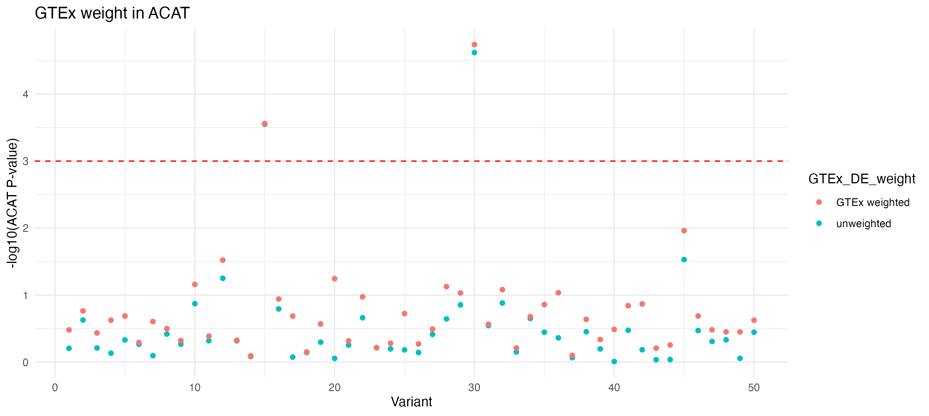
The following R code demonstrates the use of ACAT on simulation data. This method aggregates multiple rare genetic variant signals within a genomic region or gene, accounting for the heterogeneous directions and magnitudes of variant effects on the phenotype. Additionally, it incorporates GTEx data in simulations to enhance realism and applicability in genetic research.
Key Elements of the R Code:
Loading Necessary Libraries: The script loads R packages like
ggplot2,dplyr,reshape2, andACATfor data manipulation, statistical analysis, and visualization.Simulating Data: It simulates genetic data, including phenotypes, genotypes, and annotations such as CADD scores, allele frequencies, and pathogenicity scores, setting a realistic backdrop for applying the ACAT method.
Generating P-values with Outliers: A function
generate_pvalues_with_outliersproduces example p-values with intentional outliers, this will be necessary to show ACAT’s ability to handle diverse data distributions.Data Aggregation and Visualization: Post-simulation, the script aggregates and visualizes the data, highlighting the distribution of original scores and p-values through histograms and scatter plots.
ACAT Function Application: At its core, the script applies the ACAT function to the simulated p-values. This function uses the Cauchy distribution to combine p-values across multiple tests or variants, aiding in identifying genuine genetic associations.
Incorporating GTEx Data: The code uses real data for GTEx gene expression to provide a context for ACAT application, more similar to real-world genetic analysis.
Analysis and interpretation: The script includes modeling steps with
limma. This is used for gene expression data, especially the use of linear models for analysing designed experiments and the assessment of differential expression.
This R code example allows us to observe the ACAT method’s with simple data. The visual outputs illustrate the impact of different data distributions on ACAT results, demonstrating its effectiveness in genetic association studies, especially those focusing on rare variants.
R code examples
# Loading necessary libraries
library(ggplot2)
library(reshape2)
library(dplyr)
library(scales)
library(ACAT)
library(EnhancedVolcano)
library(gridExtra)
library(limma)
library(reshape2)
# library(devtools)
# devtools::install_github("yaowuliu/ACAT")
# if (!requireNamespace('BiocManager', quietly = TRUE))
# install.packages('BiocManager')
# BiocManager::install('limma')
# Set up example test data ----
# Set seed for reproducibility
set.seed(123)
# Number of variants
n_variants <- 50
# Simulate Associated Variables
CADD_score <- runif(n_variants, 1, 20) # Score can be any value
allele_frequency <- runif(n_variants, 0, 1) # Score can be any value
pathogenicity <- rbinom(n_variants, 1, 0.5) # Score can be any value
# Simulate P-values with a few outliers
generate_pvalues_with_outliers <- function(n, outlier_indices) {
p_values <- runif(n, 0, 1)
# Assigning very small values to selected outliers
p_values[outlier_indices] <- runif(length(outlier_indices), 0, 0.001)
return(p_values)
}
# Indices of potential outliers
outlier_indices <- sample(1:n_variants, 2) # Randomly select 2 variants to be outliers
# Generate P-values
CADD_score_pval <- generate_pvalues_with_outliers(n_variants, outlier_indices)
allele_frequency_pval <- generate_pvalues_with_outliers(n_variants, outlier_indices)
pathogenicity_pval <- generate_pvalues_with_outliers(n_variants, outlier_indices)
# Combine variables into a single dataframe for visualization
variant_data <- data.frame(
variant = rep(1:n_variants, times = 6),
measure = rep(c(
"CADD_score", "allele_frequency", "pathogenicity"
), each = n_variants * 2),
type = rep(c(
rep("Original Score", n_variants), rep("P-Value", n_variants)
), times = 3),
value = c(
CADD_score,
CADD_score_pval,
allele_frequency,
allele_frequency_pval,
pathogenicity,
pathogenicity_pval
) # Alternating Original Scores and P-values for each measure
)
# Melt the data for ggplot
variant_data_melted <- melt(variant_data, id.vars = c('variant', 'measure', 'type'))
# Calculate the significance threshold for P-values (not log-transformed)
significance_threshold <- 0.05 / n_variants
# Separate the data into two parts: one for original scores and one for P-values
original_scores_data <- variant_data_melted %>% filter(type == "Original Score")
p_values_data <- variant_data_melted %>% filter(type == "P-Value")
# Plot for original scores
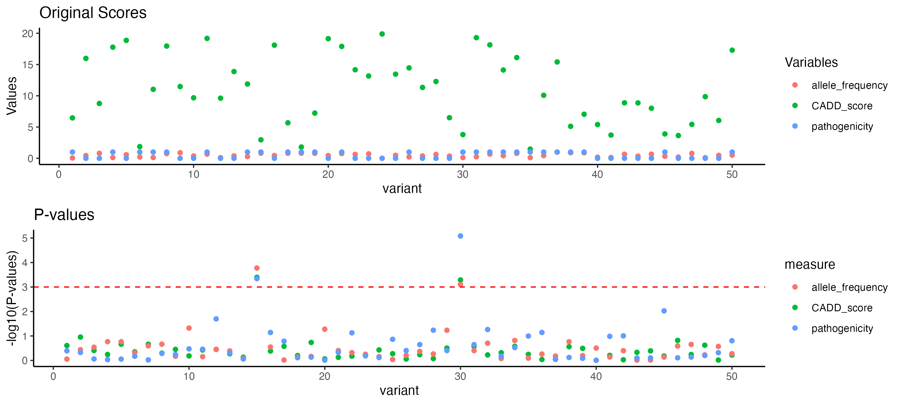
p_original_scores <- ggplot(original_scores_data, aes(x = variant, y = value, color = measure)) +
geom_point() +
theme_classic() +
labs(title = "Original Scores", y = "Values", color = "Variables")
# Plot for P-values with log scale
p_p_values <- ggplot(p_values_data, aes(
x = variant,
y = -log10(value),
color = measure
)) +
geom_point() +
theme_classic() +
labs(title = "P-values", y = "-log10(P-values)") +
geom_hline(aes(yintercept = -log10(significance_threshold)),
linetype = "dashed",
color = "red")
# Combine the two plots
p_combined <- grid.arrange(p_original_scores, p_p_values, ncol = 1)
print(p_combined)
# Save the combined plot (optional)
# ggsave("./images/p_combined.png", plot = p_combined) #, width = 8, height = 12)
# ACAT library ----
# Assuming variant_data_melted is the dataframe created in your previous code
# Filter the data to include only P-values
p_values_data <- variant_data_melted %>%
filter(type == "P-Value") %>%
mutate(log_p_value = -log10(value))
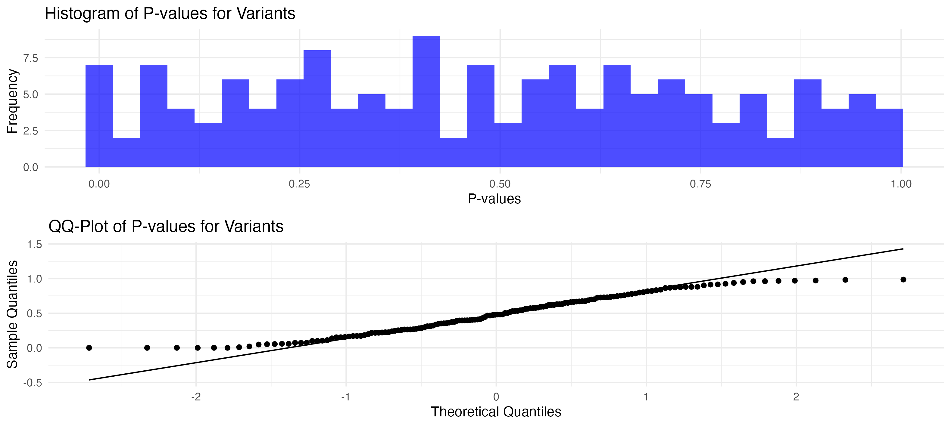
# Plot the histogram of P-values
p_histogram <- ggplot(p_values_data, aes(x = value)) +
geom_histogram(bins = 30,
fill = "blue",
alpha = 0.7) +
theme_minimal() +
labs(title = "Histogram of P-values for Variants", x = "P-values", y = "Frequency")
# Display the histogram
print(p_histogram)
# QQ-Plot of P-values
p_qqplot <- ggplot(p_values_data, aes(sample = value)) +
geom_qq() +
geom_qq_line() +
theme_minimal() +
labs(title = "QQ-Plot of P-values for Variants", x = "Theoretical Quantiles", y = "Sample Quantiles")
# Display the QQ-plot
print(p_qqplot)
# Combine the two plots
p_hist_qq <- grid.arrange(p_histogram, p_qqplot, ncol = 1)
print(p_hist_qq)
# ggsave("./images/p_hist_qq.png", plot = p_hist_qq)
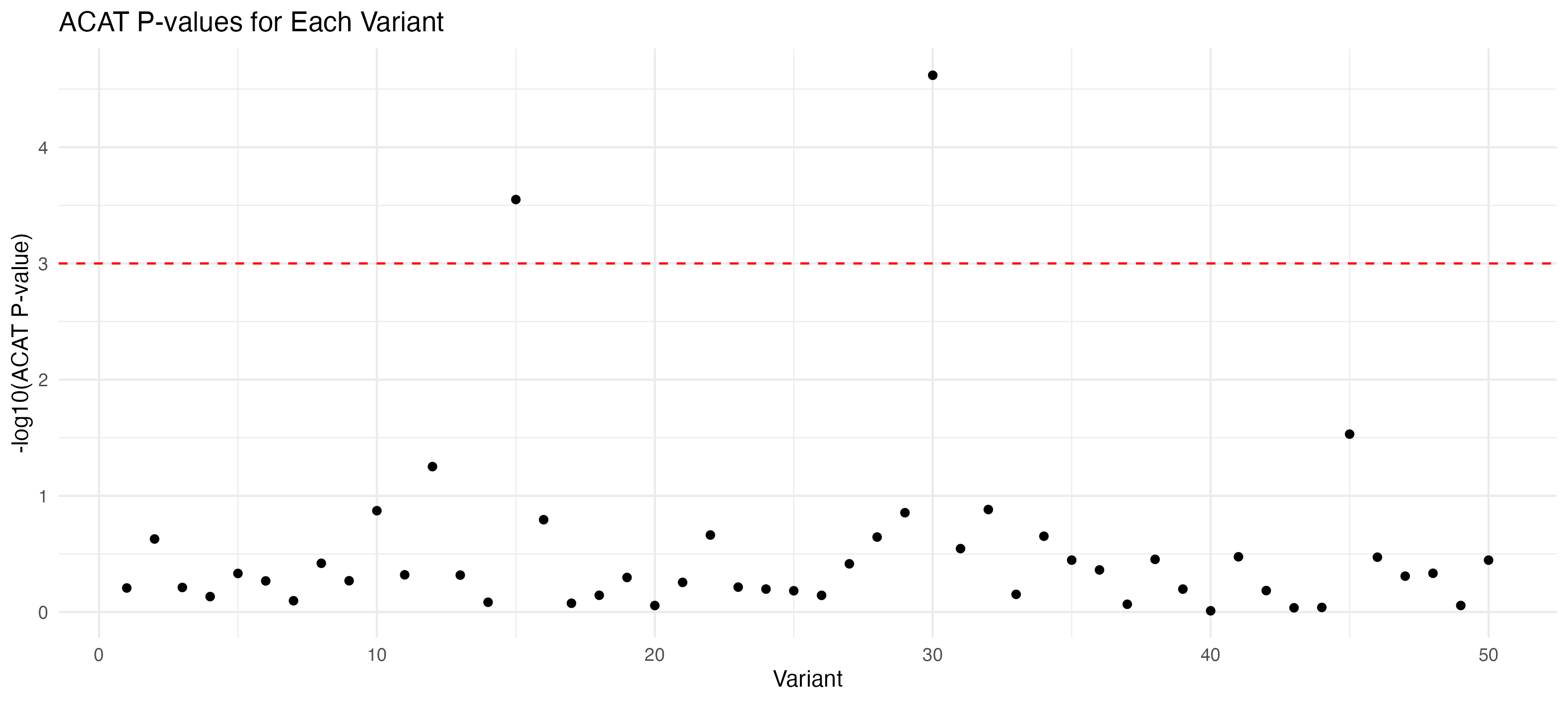
# Group by variant and apply ACAT
p_values_per_variant <- p_values_data %>%
	group_by(variant) %>%
	summarize(aggregated_pval = ACAT(Pvals = value))

# Apply ACAT to aggregated P-values for each variant
acat_results_per_variant <- apply(p_values_per_variant[, -1], 1, function(pvals) ACAT(pvals))

# Prepare data for visualization
acat_results_df <- data.frame(Variant = p_values_per_variant$variant, ACAT_P_Value = acat_results_per_variant)

# Plot ACAT results for each variant
p_acat <- ggplot(acat_results_df, aes(x = Variant, y = -log10(ACAT_P_Value))) +
	geom_point() +
	theme_minimal() +
	labs(title = "ACAT P-values for Each Variant", y = "-log10(ACAT P-value)", x = "Variant")  +
	geom_hline(aes(yintercept = -log10(significance_threshold)),
						 linetype = "dashed",
						 color = "red")

p_acat

# ggsave("./images/p_acat.png", plot = p_acat)
# GTEx ----

# GTEx_Analysis_2017-06-05_v8_RNASeQCv1.1.9_gene_median_tpm.gct.gz	Median gene-level TPM by tissue. Median expression was calculated from the file GTEx_Analysis_2017-06-05_v8_RNASeQCv1.1.9_gene_tpm.gct.gz.
# https://storage.googleapis.com/adult-gtex/bulk-gex/v8/rna-seq/GTEx_Analysis_2017-06-05_v8_RNASeQCv1.1.9_gene_median_tpm.gct.gz

tmp <- read.csv(
	file = "./data/GTEx_Analysis_2017-06-05_v8_RNASeQCv1.1.9_gene_median_tpm.gct",
	sep = "\t",
	comment.char = "#",
	skip = 2
) # Adjust this number based on whether you count the header line or not

# Calculate the row means, excluding the first two metadata columns
tmp$tissue_mean <- rowMeans(tmp[, -c(1, 2)])

tmp <- tmp |> dplyr::select("Name", "Description", "tissue_mean")

names(tmp)

# Assuming tmp has been read and tissue_mean calculated as before
set.seed(123)  # For reproducibility

# Standard deviation assumption (modify as needed)
std_dev_assumption <- 1

# Simulating 10 cases and 10 controls for each gene
n_samples <- 10

# Simulating data using a Poisson distribution
# The lambda parameter is the mean for each gene
tmp$Cases <- replicate(n_samples, rpois(nrow(tmp), lambda = tmp$tissue_mean))
tmp$Controls <- replicate(n_samples, rpois(nrow(tmp), lambda = tmp$tissue_mean))

# Assuming tmp and n_samples are defined as before
# Choose a number of genes to modify
n_genes_to_modify <- 10

# Randomly select genes
selected_genes <- sample(1:nrow(tmp), n_genes_to_modify)

# Modify the expression values for these genes
# Here, we'll increase the expression values for cases
# You can choose a multiplication factor or an additive factor
modification_factor <- 10
for (gene in selected_genes) {
	tmp$Cases[gene, ] <- tmp$Cases[gene, ] * modification_factor
}

# Reshaping the data for limma analysis
case_data <- as.data.frame(tmp$Cases)
control_data <- as.data.frame(tmp$Controls)
colnames(case_data) <- paste("Case", 1:n_samples, sep = "_")
colnames(control_data) <- paste("Control", 1:n_samples, sep = "_")
combined_data <- cbind(case_data, control_data)

# Reshape combined_data for ggplot
long_combined_data <- melt(combined_data)
long_combined_data$group <- ifelse(grepl("Case", long_combined_data$variable), "Case", "Control")

# Create the plot
ggplot(long_combined_data, aes(x = log(value), fill = group)) +
	geom_histogram(position = "identity",
								 alpha = 0.5,
								 bins = 30) +
	labs(x = "Expression Level", y = "Frequency", title = "Distribution of Simulated Expression Levels") +
	theme_minimal() +
	scale_fill_manual(values = c("Case" = "blue", "Control" = "red"))

# p_gtex_gene_median_tpm_histogram

# Creating a design matrix for the differential expression analysis
group <- factor(c(rep("Case", n_samples), rep("Control", n_samples)))
design <- model.matrix( ~ group)

# Applying voom transformation
v <- voom(combined_data, design)

# Fit the linear model
fit <- lmFit(v, design)

# Apply empirical Bayes moderation
fit <- eBayes(fit)

# Extract differentially expressed genes
results <- topTable(fit)
# results <- topTable(fit, adjust.method = "bonferroni")

results
| logFC | AveExpr | t | P.Value | adj.P.Val | B | |
|---|---|---|---|---|---|---|
| 21692 | -3.140047 | 4.68799 | -14.06914 | 2.764495e-11 | 0.0000016 | 15.700482 |
| 43000 | -3.425020 | 3.53374 | -6.37637 | 4.769799e-06 | 0.1340314 | 3.563774 |
| 30156 | -1.182569 | -0.30486 | -5.73847 | 1.785158e-05 | 0.3344196 | 2.463673 |
| 34017 | -1.562842 | 0.20193 | -5.27569 | 4.798450e-05 | 0.6594008 | 1.480612 |
| 9603 | -1.070434 | 2.41423 | -5.00915 | 8.571267e-05 | 0.6594008 | 0.751640 |
| 53242 | -1.591902 | 0.83988 | -4.85549 | 1.201280e-04 | 0.6594008 | 0.657138 |
| 51799 | 0.951387 | -0.42095 | 4.74540 | 1.531894e-04 | 0.6594008 | 0.253207 |
| 33526 | 0.951487 | -0.42095 | 4.74485 | 1.533751e-04 | 0.6594008 | 0.251985 |
| 17397 | -0.950057 | -0.42095 | -4.74068 | 1.547968e-04 | 0.6594008 | 0.242677 |
| 15000 | -0.950611 | -0.42095 | -4.73765 | 1.558397e-04 | 0.6594008 | 0.235904 |
# Assuming results has columns like "logFC" (log fold change), "P.Value", and "adj.P.Val"
ggplot(results, aes(
x = logFC,
y = -log10(P.Value),
colour = adj.P.Val < 0.05
)) +
geom_point(alpha = 0.5) +
geom_jitter(alpha = 0.5) +
scale_colour_manual(values = c("FALSE" = "grey", "TRUE" = "red")) +
labs(x = "Log Fold Change", y = "-log10 P-value", title = "Volcano Plot of Differential Expression Results") +
theme_minimal()
# names(fit)
# head(fit$coefficients)
# head(fit$p.value)
# Extract logFC, corresponding to your condition of interest (here assumed as "groupControl")
fit_results <- as.data.frame(fit$coefficients)
# Ensure the rows in tmp align with those in fit_results
fit_results$GeneDescription <- tmp$Description
fit_results$logFC <- fit_results[, "groupControl"] # Replace with the correct column name as per your design
# Extract p-values and apply adjustment
fit_results$p_value <- fit$p.value[, "groupControl"] # Corresponding p-values
fit_results$adjPVal <- p.adjust(fit_results$p_value, method = "BH") # Adjust p-values
# Enhanced analysis volcano plot ----
# Extracting necessary data from the fit object
volcano_data <- data.frame(logFC = fit$coefficients[, "groupControl"], PValue = fit$p.value[, "groupControl"])
# Add gene descriptions from tmp to volcano_data
volcano_data$GeneDescription <- tmp$Description
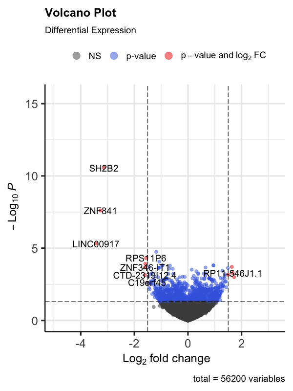
EnhancedVolcano(
volcano_data,
lab = volcano_data$GeneDescription,
x = 'logFC',
y = 'PValue',
pCutoff = 0.05,
FCcutoff = 1.5,
# Adjust fold change cutoff as appropriate
title = 'Volcano Plot',
subtitle = 'Differential Expression'
)
# p_gtex_gene_median_tpm_volcano
# 8x6 png
# FC weights ----
# To convert the p-values from your differential expression analysis into weights scaled between 0 and 1, you can invert the p-values and then normalize them so that they sum up to 1. This approach assigns higher weights to genes with lower p-values (indicating higher significance), which aligns with your goal of giving more weight to genes more likely to be causal.
# Apply negative log10 transformation
fit_results$NegLogPValue <- -log10(fit_results$p_value)
# Normalize the negative log p-values
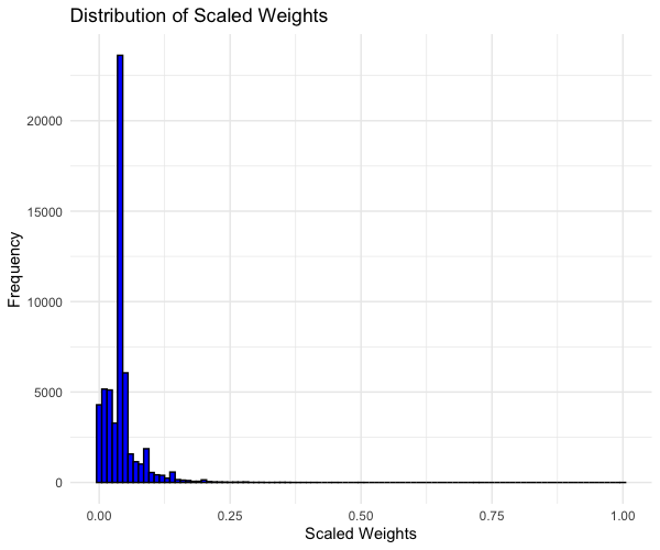
fit_results$ScaledWeights <- fit_results$NegLogPValue / max(fit_results$NegLogPValue)
# Histogram of Scaled Weights
ggplot(fit_results, aes(x = ScaledWeights)) +
geom_histogram(binwidth = 0.01,
fill = "blue",
color = "black") +
labs(x = "Scaled Weights", y = "Frequency", title = "Distribution of Scaled Weights") +
theme_minimal()
# p_gtex_gene_median_tpm_scaledweight
# Weights in ACAT ----
# we want the top ten volcano_data$GeneDescription ranked on fit_results$ScaledWeights, which we can then use the top ten names from volcano_data$GeneDescription to pretend that they consist of 50 variants from the df variant_data_melted. the variant_data_melted$variants are numbered 1-50 so lets give 10 variants to each one volcano_data$GeneDescription (gene name).
# we can then merge those two dataframes on GeneDescription.

# Add ScaledWeights to volcano_data
volcano_data$ScaledWeights <- fit_results$ScaledWeights[match(volcano_data$GeneDescription, fit_results$GeneDescription)]

# Rank and select the top 10 genes
top_genes <- head(volcano_data[order(-volcano_data$ScaledWeights), "GeneDescription"], 10)

# Create a dataframe
variants_to_genes <- data.frame(
	GeneDescription = rep(top_genes, each = 5),
	variant = rep(1:50, length.out = length(top_genes) * 5)
)

# Merge the dataframes
merged_data <- merge(volcano_data, variants_to_genes, by = "GeneDescription")

# Merge with variant_data_melted
variant_data_melted_gtex <- merge(merged_data, variant_data_melted, by = "variant")

# ACAT GTEx ----

# Filter the data to include only P-values
p_values_data <- variant_data_melted_gtex %>%
	filter(type == "P-Value") %>%
	mutate(log_p_value = -log10(value))

# Group by variant and apply ACAT
p_values_per_variant <- p_values_data %>%
	group_by(variant) %>%
	summarize(aggregated_pval = ACAT(Pvals = value))

p_values_per_variant_weight <- p_values_data %>%
	group_by(variant) %>%
	summarize(aggregated_pval = ACAT(Pvals = value, weight = ScaledWeights))

# Test weights ----

# Transform and scale p-values into weights
p_values_data <- p_values_data %>%
	mutate(
		LogWeight = -log10(value),
		ScaledWeight = (LogWeight - min(LogWeight)) / (max(LogWeight) - min(LogWeight))
	)

# Group by variant and apply ACAT with new ScaledWeights
p_values_per_variant_weight <- p_values_data %>%
	group_by(variant) %>%
	summarize(aggregated_pval = ACAT(Pvals = value, weight = ScaledWeight))

# Prepare data for the first plot (without weights)
acat_results_df <- data.frame(
	Variant = p_values_per_variant$variant,
	ACAT_P_Value = p_values_per_variant$aggregated_pval,
	GTEx_DE_weight = "unweighted"
)

# Prepare data for the second plot (with weights)
acat_results_df_weighted <- data.frame(
	Variant = p_values_per_variant_weight$variant,
	ACAT_P_Value = p_values_per_variant_weight$aggregated_pval,
	GTEx_DE_weight = "GTEx weighted"
)

acat_results <- rbind(acat_results_df, acat_results_df_weighted)

p_acat_weight_GTEx <- acat_results |>
	ggplot(aes(x = Variant, y = -log10(ACAT_P_Value))) +
	geom_point(aes(color = GTEx_DE_weight)) +
	theme_minimal() +
	labs(title = "GTEx weight in ACAT", y = "-log10(ACAT P-value)", x = "Variant") +
	geom_hline(aes(yintercept = -log10(significance_threshold)),
						 linetype = "dashed",
						 color = "red")

p_acat_weight_GTEx
# Save the combined plot (optional)
# ggsave("./images/p_acat_weight_GTEx_test.png", plot = p_acat_weight_GTEx)